News
Google changed Android name and logo to embrace the future

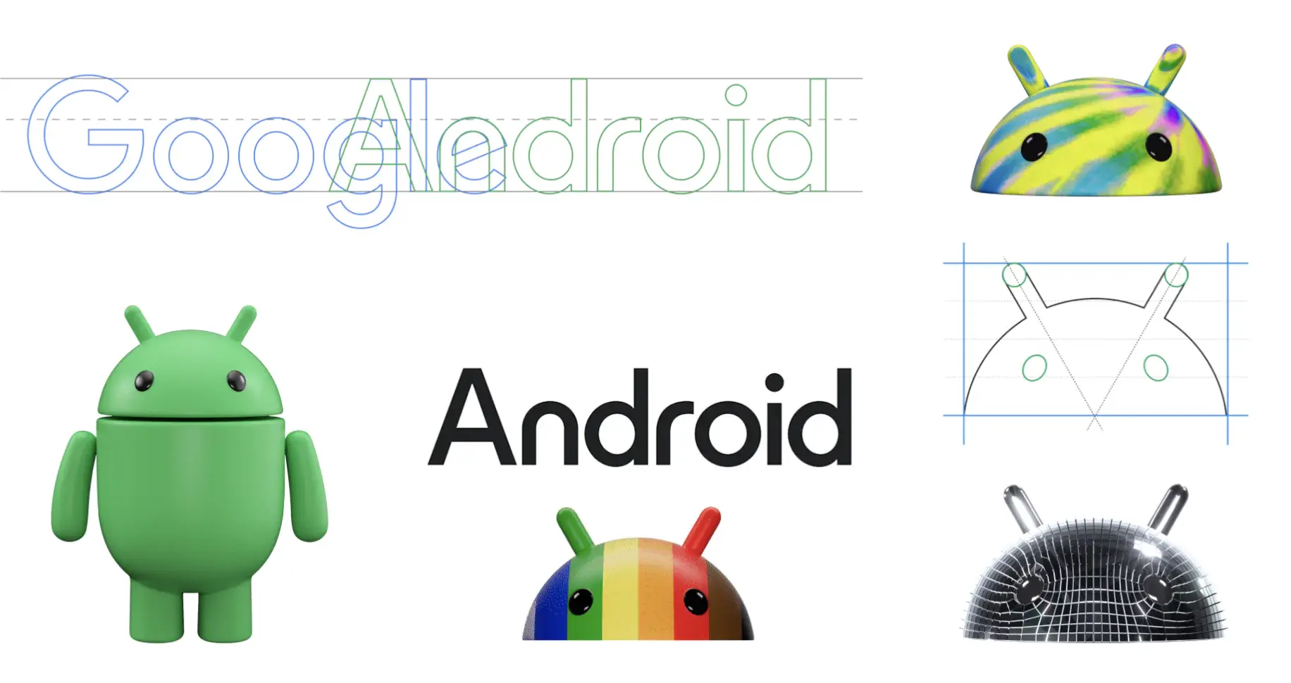
Google just released a makeover for the Android brand, which was last redesigned in 2019. This is just a reminder that the release of Android 14 is getting closer. According to Google, the Material design was inspired by Material to complement the Google brand palette and be adaptable. To help elevate the logo and give it more weight when put next to Google’s logo, it first abandons Android’s earlier lowercase stylization. The Android mascot, Bugdroid, now has a contemporary 3D appearance, with the logo being updated.
The green robot, cherished by the Android community, is also significantly impacted by this refresh since Bugdroid has undergone a 3D redesign that makes it more lively and real. The new design aims to convey the open, iterative, and inclusive basic values of Android. The small adjustments to the Android wordmark, such as capitalizing the A,” have been focused by the brand on a revamp and giving letters a more rounded appearance. This can be considered a major change, as this is one of the features that has remained unchanged since it was introduced.
Google is attempting to make the robot’s transfer from the virtual to the physical world in the simplest way possible while increasing the robot’s versatility and capacity to adapt to a variety of channels, platforms, and circumstances. Now coming to when this change will be visible in our gadgets, it was promised by the firm in their presentation that the new revamped Android brand and logo will begin to appear on devices this year and beyond. This hints at the arrival of Android 14, which may bring formal adoption.
However, the revamped design was showcased for the very first time in front of the general public in previous years. In June, it seems that Google wants to await and reconsider their decision, following the words of Jason Fournier, director of Android Consumer Brand Management.
News
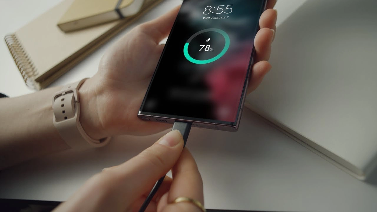
Samsung Prioritizes Faster Charging in 2024 Smartphones

The first quarter of 2024 is already over; during this interval, Samsung has introduced several Galaxy smartphones of particular belonging, such as the flagship Galaxy S24 series, the Galaxy A55 and Galaxy A35, the mid-range ones, the Galaxy A15 and Galaxy F15, the budgetable ones, and many more. But the fact is, after being the latest smartphones, they have a lack of ‘charging speed.’
Undoubtedly, Samsung is leading the tech industry with its top-notch features, design, and larger batteries, as compared to other Android manufacturers, but despite all this, it has a massive lack of charging speed. Samsung usually attaches larger batteries to its Galaxy smartphones to enhance the users’ non-stop-using experience. But a larger battery isn’t worth it unless it has a good charging speed.
On the other hand, Chinese manufacturers are equipping their smartphones with charging speeds north of 100W, whereas 45W is the maximum speed you can get on Galaxy smartphones. However, even 45W charging is quite rare among Galaxy phones. Samsung has launched most of the Galaxy devices in the last couple of years, including the flagship with support for 25W.
Here we are making things easy for you if you are looking to buy a Galaxy smartphone that debuted in 2024 with the support of 45W charging speed by mentioning a list of devices:
- Galaxy S24 Ultra
- Galaxy S24+
- Galaxy F55
- Galaxy M55
- Galaxy C55
The list is quite short, even considering that the Galaxy F55, M55, and C55 are just rebranded variants of the same smartphone for different regions. Now Samsung is setting up to launch its next-generation foldable devices, the Galaxy Z Fold 6 and Galaxy Z Flip 6, in July, but it is yet to be confirmed whether these devices will get a boost in charging speeds from 25W or not.
News
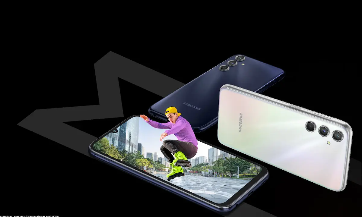
New Galaxy Phone In Existence: Samsung Galaxy M35 5G Spots On Geekbench

The Korean brand – Samsung has recently announced its two mid-range Galaxy smartphones – Galaxy A55 5G and Galaxy A35 5G. A new benchmark listing has a spot for Samsung’s affordable smartphone, Galaxy35 5G.
Samsung is now gearing up for its next affordable Galaxy smartphone, the M35 5G, as the reports are unvunveilhey have found a new benchmark listing for Samsung the Galaxy M35 5G.
The smartphone has been spotted with the model number as an identification code – SM-M356B on the Geekbench 6.2.2 database. Not only this, but it also confirmed the presence of 6GB of RAM and Android 14 OS. The chipset also came to know which is the latest Exynos 1380.
The codename for the motherboard is also mentioned, which is ‘s5e8835.’ The reports say that it has scored 656 and 1967 points in performance scores on the benchmarking platform. Exynos 1380 is the latest chipset of the Korean brand, which is a 5 nm processor. It consists of 4 Cortex A78 cores, which clock at 2.4GHz, and 4 Cortex A55 cores, which clock at 2.0GHz. It is coupled with a Mali g68 MP5 GPU. It also has an AI Engine.
This also offers connectivity options, which include the latest Bluetooth version 5.3 and Wi-Fi 802.11 ax with three bands. It supports a camera resolution of at least 200MP for capturing images, and for video recording, there is support for up to 30fps 4K recording. The storage supported is UFS v3.1, and RAM will be of the LPDDR4x/5 type.
Samsung has recently debuted its two smartphones, Galaxy A55, and Galaxy A35; the Galaxy A35 5G smartphone is powered by Exynos 1380 chipset. From this perspective, Galaxy M35 5G could be a variant of Galaxy A35.
At the moment, no specs and features of the device have been revealed or leaked. Still, since Galaxy M series smartphones usually have a bit higher battery power of at least 6000mAh, the forthcoming Galaxy M35 5G smartphone also arrives with the same battery power.
Firmware
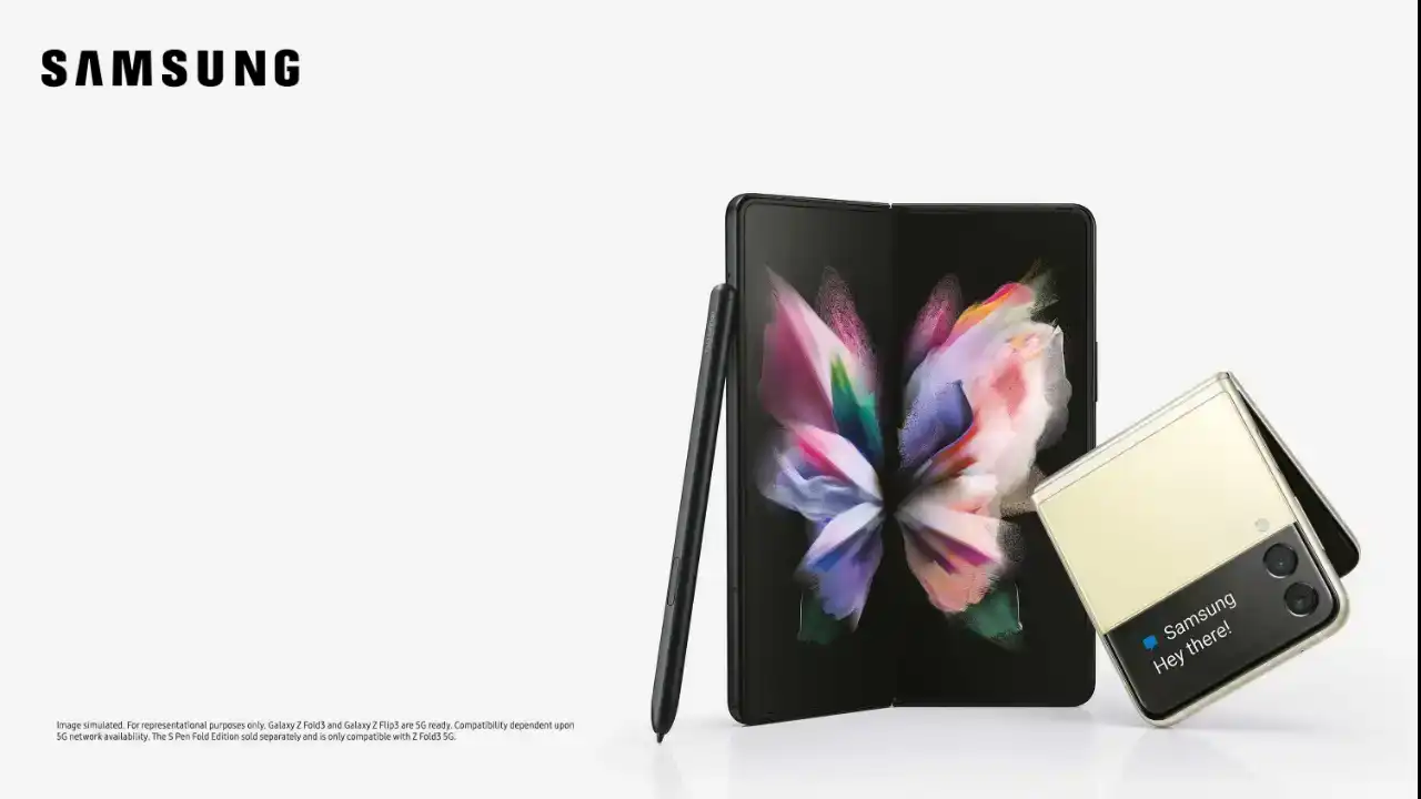
Verizon rolls out the March 2024 security patch update for the Galaxy Z Fold 3 and Galaxy Z Flip 3 devices

Verizon has rolled out the March 2024 security patch update for the Galaxy Z Fold 3 and Galaxy Z Flip 3 devices. Earlier, these devices had received the same update outside the US, but now they are gradually expanding to the US.
The Galaxy Z Fold 3 and Galaxy Z Flip 3 are spotted getting new updates with the firmware version numbers F926USQS5HXBD and F711USQS6HXBD, respectively. It is worth noticing the update is currently available for the devices locked to Verizon, but it will soon be available on more carriers.
For your information, the latest update for Galaxy Z Fold 3 and Galaxy Z Flip 3 doesn’t bring any significant changes, but as it is the latest security patch, it will provide some internal fixes to maintain the security of the devices.
If you are getting some other issues from the last update, you should also update the device to the latest update, as it may also address some issues. Along with the update, other improvements may also be made to enhance the overall performance of the devices.
Suppose you use the Galaxy Z Fold 3 or Flip 3 device in the US. In that case, you can update the device to the latest version by simply going to the system settings and then to the software update. If you haven’t received the update, you should wait for some time, as it may arrive in the next few days.


