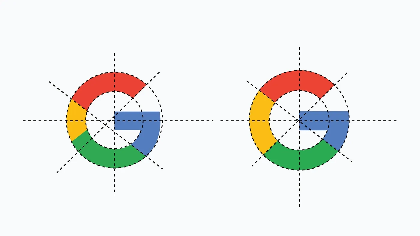
We look at the popular search engine Google’s logo uncountable times a day, as Google has become an essential part of our day-to-day lifestyle. Wherever we look at the logo, one question always pops up in our heads “Why is Google’s logo looks imperfect?” If you pay close attention to the “G- in blue, red, green, and yellow colors,” you will get to know that the G doesn’t form a perfect circle, and neither the colors occupy the same area.
We may think that the logo is imperfect, has flaws, and doesn’t follow the pattern, but it didn’t seem to be the case. Besides, it seems that Google’s logo is designed with these rule-breaking patterns by its creators consciously. Talking about mathematical perfection, the logo may not have it, but it sure pursues optical perfection. All of the issues with Google’s logo have been explained by the popular designer Arun Jangra.
Informatively, if we talk about the imperfect circles of G, both (outer and inner) circles aren’t aligned with the logo’s edges, because of which a clear space is visible between both the outer edges. Notably, when he placed superimposed lines to analyze the logo’s geometry, it has found that these lines didn’t consist of any mathematical rules and didn’t cross at the midpoint. Now let’s look at the matter with colored stripes.
In the logo, we can clearly see that all four colors of this logo don’t occupy equal space, but the question is, “Why”? We can find its answer after correcting the errors. Let’s know what happened when the designer, Arun, corrected these errors. Let us tell you, after getting a mathematically perfect logo, it starts to look a little unbalanced optically. Let us tell you why. The details are listed below.
Let us tell you, in the mathematically perfect logo, the blue part stands out too much and makes the logo look odd. Not only that, but the expanded yellow area also makes it look more dominant, as yellow is a brighter color than the others. In simpler words, the Google logo won’t look optically balanced if we make it mathematically perfect. A similar matter is up with the Google Chrome logo as well.
Google releases Android 14 Beta 1.1: Check out the list of bug fixes
To get the Google logo’s this design, its designers have used techniques such as “overshooting.” Informatively, Google’s current logo was launched back in the year 2015, and it is possible that Google will change it sooner or later.
