Apps & Services
Samsung adds its own One UI to Google Messages’ new interface
The messaging program Google Messages was created for use with its Android and Wear OS mobile operating systems. It serves as a transitional platform between conventional SMS, RCS, and instant messaging. It is essentially Google’s response to Apple’s iMessage app. Changes were brought about in terms of a redesigned voice recorder interface, improved app security, a new feature to organize conversations, and the discovery of potential support for satellite SMS. Also, it is known that the firm is developing a brand new user interface for the Google Messaging app.
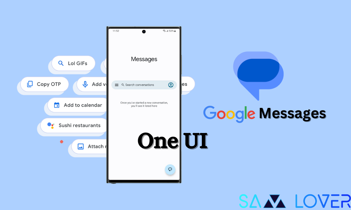
It seems that Samsung handsets are getting ready to receive the updates, as Samsung phones are now displaying the redesigned Google Messages home screen, which does away with the navigation menu. Google Messages has a build for Samsung that supports ecosystem sync on tablets and wearables. The app is also optimized for One UI and has a wide header for better reachability in addition to that feature. Other than this, a traditional component of the application interfaces of Google services and the long-aged hamburger symbol were replaced with the company’s logo.
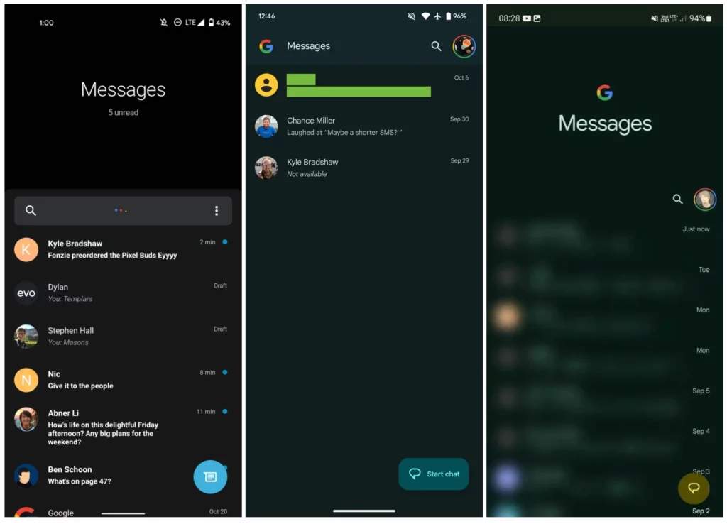
The four-color “G” logo has joined the enormous heading Messages, which is still present, to create extremely noticeable Google branding, which is probably the goal of the overall homescreen redesign. To replace the search field, a magnifying glass symbol has been added to the corner next to your Google Account avatar. To access Archived, Spam, and Banned, tap it to bring up a menu. Mark all as read, device pairing, your message data, message settings, and help and feedback.
There are additional changes to the search page for fullscreen. It appears a little weird for these two symbols to show to the right of that line without anything else there. Instead of a rounded square or rectangle, messages continue to employ a circular FAB. The stock Google app now chooses a rectangle with rounded edges and a clear indication of the action to which the button refers, unlike the floating action button that is located in the lower right corner of the app and updates the app icon while maintaining the circular shape.
Further, the graphic renewal has also started to appear on Samsung smartphones, which welcome the innovations by integrating them with the One UI’s aesthetic standards.