Apps & Services
Google Maps Gets a Refreshing Makeover in UI with New Color Palette
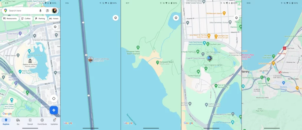
The popular navigation tool Google Maps, which is used by millions of people worldwide, has had a major visual makeover. A color design of bluer tokens has taken the place of the platform’s long-standing signature yellow and white style. Users’ responses to this upgrade, which deviates from Google Maps’ conventional layout, have been mixed. Google Maps users have expressed a white range of view points in response to the launch of the new color scheme. While some people have embraced the modern style, others have stated that they prefer the traditional yellow and white combination. Supporters of the new design commend its elegant and refined appearance, arguing that it is consistent with Google’s current focus on a simple user interface. They also like that map features are now more visible, especially in low-light conditions.
A fresh range of new colors:
- Parks and other natural places are painted a paler shade of green, which creates a lovely contrast with the highways, which are painted grey instead of off-white.
- Speaking of the natural world, the new color makes the dashed trail routes much less noticeable.
- Depending on their prominence, buildings and other structures are still either light yellow or gray.
- Oceans and lakes, for example, seem to have a paler hue of blue these days. To further set it apart from the surrounding map section, the traffic green has also been enhanced.
- For good thematic coherence with roadways, motorways are colored much darker gray with blue undertones.
- Restaurant pins are orange and stand out significantly more when there is less yellow.
The intention to improve map features’ readability and visibility is Google’s justification for this modification. July saw the start of the testing, and in October, Google announced that updated colors throughout the maps would be returning. A bigger deployment for Android and iOS is currently in process, while some users have had this updated palette for a few weeks. Try forcing Google Maps to cease multitasking or shutting down if you don’t already have it to get the updated colors to load.
Google’s choice to update the look of Google Maps is indicative of its dedication to changing to accommodate changing customer tastes and breakthroughs in technology. On the other hand, the sentimental link to the previous design highlights how crucial it is to honor user familiarity with the brand.
Thanks to “9to5google“