Apps & Services
Android Auto Users Find Google Maps’ Redesign More Annoying Than Helpful
It’s been a long time since Google has been working on implementing upgrades for the Google Maps interface on Android Auto screens. Well, Google has been rolling out new changes within the UI of Google Maps; however, it brings good news and bad news at the same time, making the Maps interface a little more inferior than before.
While the newest update brought about significant changes that eventually allow different Android Auto screens to adapt the Google Maps’ interface in order to make the navigation much easier to read, it makes the user experience more annoying as well.
Among various complaints, a user via Reddit confirmed that they have been receiving a new update that in turn brought about certain changes in the Google Maps interface.
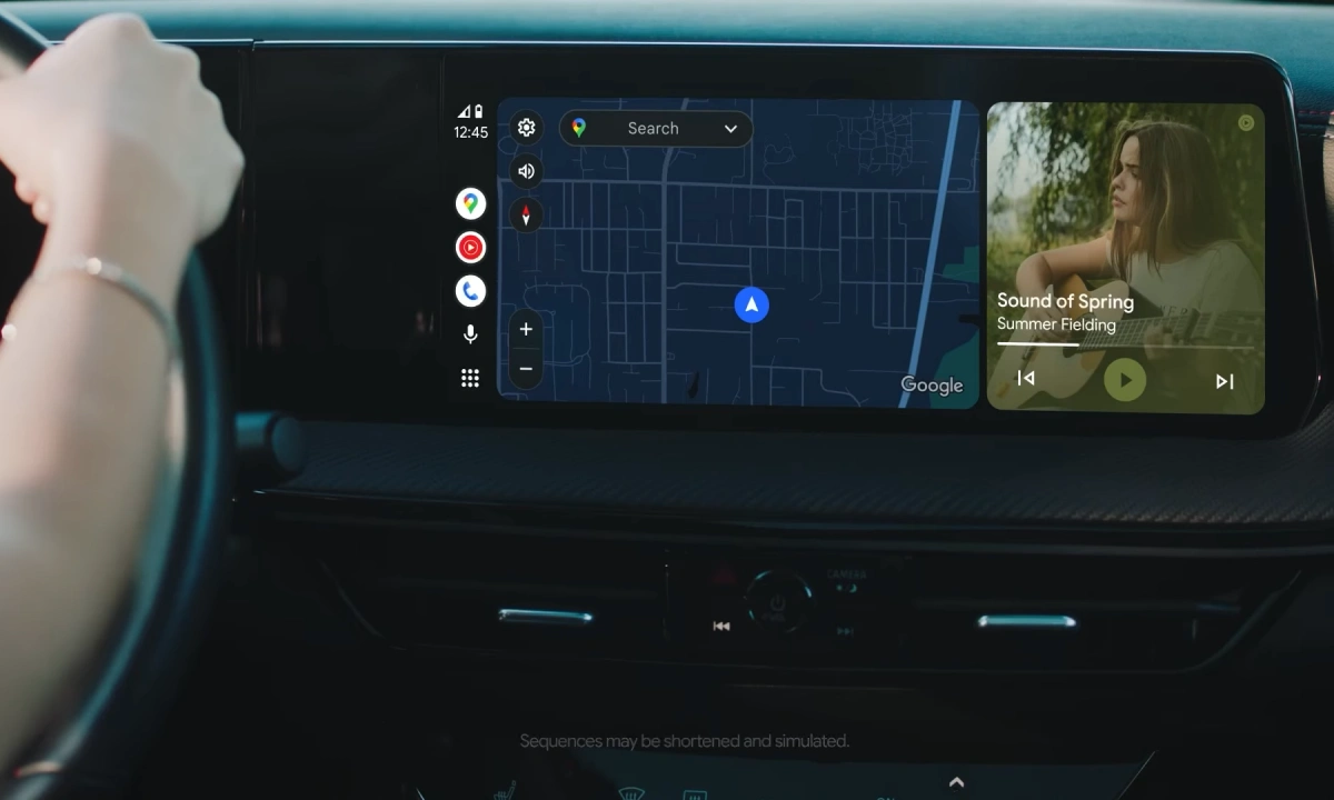
Apparently, the Maps’ position when opening the Android Auto screens takes the center part of the display, which is a great tweak; however, this proved to be annoying for the users in a practical way as the destination menu covers the entire view of the route by overlapping the map.
The user stated that the maps’ position was previously aligned to the right, making it possible for the users to see their current entire route; meanwhile, after updating, a large box containing destinations is eventually causing problems in viewing the correct route display due to the maps’ center position. Also, there seems to be no possible way to solve this problem, at least for now.
Moreover, it was noticed that the newly released Android Auto 13.6 version is not the actual cause of this problem, but users need to wait till Google acknowledges the issue and comes up with a proper solution.