Apps & Services
Google App Shortcut Carousel Gets a Makeover
Google offers every possible way that lets users have a more efficient and convenient experience, with its app being used widely, especially when it comes to making its app more optimal and getting everything in one place. On that note, Google is currently working on offering a cleaner look to its shortcut carousel, which starts hitting the beta testers now.
With the latest Google app beta v15.34 version, spotted by 9to5Google, Google is revamping the shortcut carousel that can be scrolled through just below the search bar.
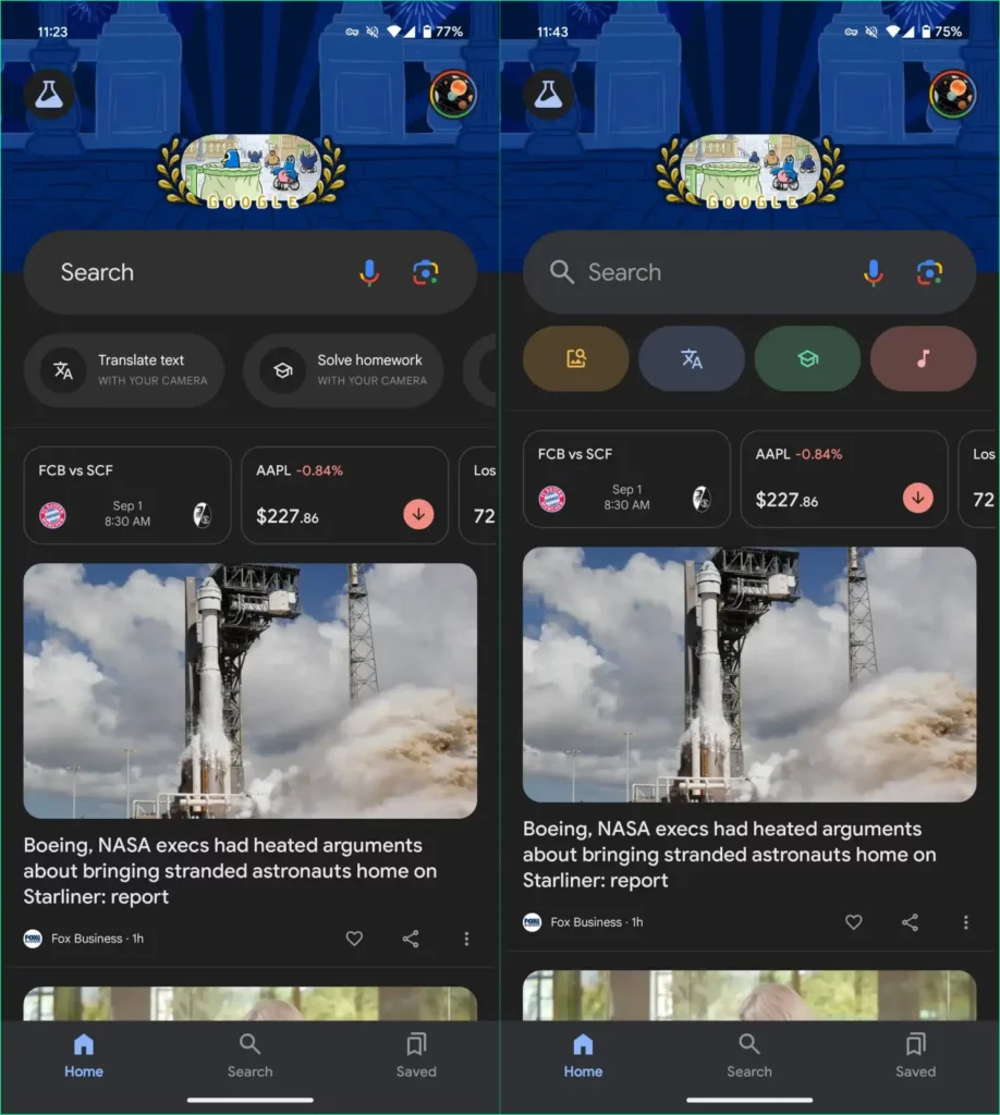
This revamped look eventually involves a new look at the app’s interface that significantly replaces the text-based shortcut buttons, including translate text, solve homework, identify a song, shop for products, and more, with clean and colorful pill-shaped icons.
Also, despite a cleaner look to the interface, this newest change further allows more additional shortcuts to fit on the screen, eliminating those untidy text-based labels.
Moreover, Google is looking to significantly optimize the shortcut carousel, making the shortcuts fit all at once, with its UI being more light, clean, and spacious. Now, if you are currently on the latest Google app beta, you can experience the latest changes ahead of the stable release.